Personal Project
Goodreads Reimagining
App Design
- Figma
As a personal project, I wanted to try my hand at imagining what the Goodreads app might look like with the newer UI refresh being rolled out accross the website, along with some much-needed reorganization. For a service that prides itself on reading tracking with a social aspect, it seemingly puts social first with a feed, and book tracking second by burying it with several clicks.
Problem
The current Goodreads app design opens the user up to a social media feed filled with status updates, following and friend requests between members, others' likes of reviews, and replies that generate separate entry logs on the feed which may or may not be applicable to the user. Instead of putting the books front-and-center, user reviews and activity (updating reading progress, adding books, and linking up with friends) are the most promenient.
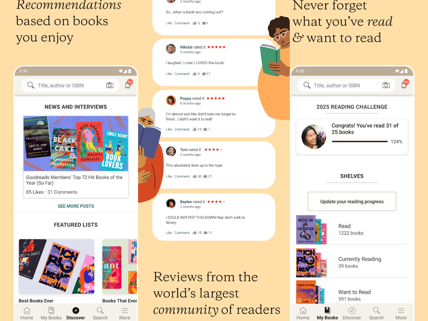
While we're always told not to judge a book by its cover, it's also important to keep in mind that a book cover is one of the most powerful ways of promoting a book. It can impact whether or not it stops a reader long enough in their scroll or in a store to click or pick it up. However, with the lack of images in the social feed, users have to take extra steps by tapping into the review of someone they have followed or friended to learn more about a potential read, creating additional steps to finding a new book. The current feed fails to produce anything visually appealing, aside from a simple star rating, to catch the user's eye long enough (as seen in the middle section of the image below).
Additionally, those that frequent Instagram, TikTok, and other platforms tend take on a yearly challenge to read a certain number of books, which is a feature within Goodreads that's pushed to the top of the "My Books" section in the app with all of their bookshelves. This is a feature that keeps readers engaged in wanting to continuously return to the app to update their status, rather than seeing yet another person a friend has interacted with on the feed that week. Highlighting this, in combination with better imagery and recommendations, encourages a reader to return during — and after — reading another book.
Solution
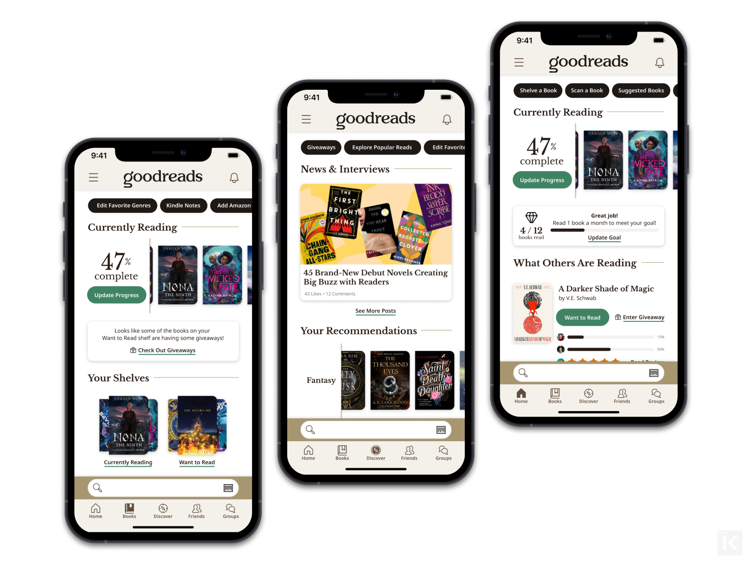
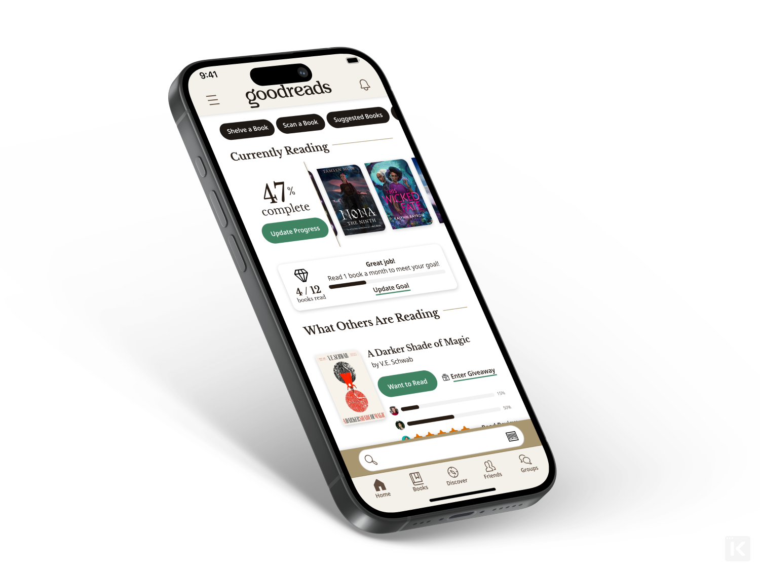
With the goal to place more focus on books and reading, updating the home screen to feature a "Currently Reading" section in the top half of the screen allows users to quickly and easily update their progress and swipe through all of their current reads they might be rotating through.
"Reading Goals" are placed directly under the "Currently Reading" shelf to better highlight and track overall progress and pacing.
Taking data from the previous home feed, friends' reading and reviewing status updates can be compiled alongside a quick overview of the book, giving the user the option to see more, add to a shelf, or enter a giveaway with a single click. Meanwhile, if a user wants to see a more expanded version of the feed, they can visit the new "Friends" tab at the bottom, thanks to the room made for it by giving the search bar a permanent home just above the navigation and overhauling the "More" tab.
Content from the "More" tab is moved to the hamburger menu for the miscellanous, necessary menu items that don't have a place in the primary navigational tabs. In addition to that update, instead of hiding secondary or tertiary pages at the bottom of each main navigation tab's screen, they've been reorganized into a set of quick navigation chips at the top of the screen to swipe through.